Articles

How to design navigation for large and small screens
I recently completed a set of instructional videos for Balsamiq for a free course called How to design navigation for large and small screens. The set of 8 videos cover: horizontal and vertical menu bars, tabs, dropdowns, buttons, mega-menus, links, carousels, cards,...

UX Australia podcast interview
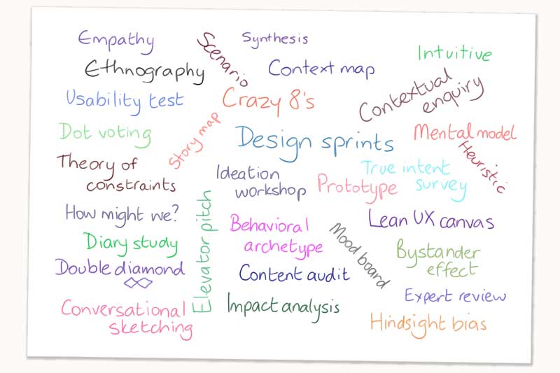
Today Steve is joined by Donna Spencer to discuss the two books she is writing in 2020, and her upcoming UX Australia 2020 workshop, Facilitating Design Thinking Workshops.

Information Architecture Expert Panel – Part One
I recently spoke with Boxes and Arrows ahead of World IA Day on the topic of IA, where it is now and where it is going; as did many IA professionals. Here is the first of three articles that came out of that conversation:...
The ultimate IA reading list
Within the UX industry, there are myriad terms and concepts you’ll need to understand in order to get your job done. One of the most common you’ll come across is information architecture (IA). What is it? How do you find it? How do you research it? And how do you...

De-jargonising Design
Words are amazing things. They pack big thoughts into small spaces and let us get ideas out of our head and into someone else’s head. Jargon is an even more amazing thing; it lets us communicate complex ideas with our peers. Instead of having to say that we’ll get...
Influences, the nature of liking and relationships
I'm meant to be smashing out some wireframes for a client, but instead I'm sitting here with my headphones on, listening to Jean-Michel Jarre and thinking about relationships, influences, and what it means to like something (in...

Why it’s Okay to Reinvent the Wheel
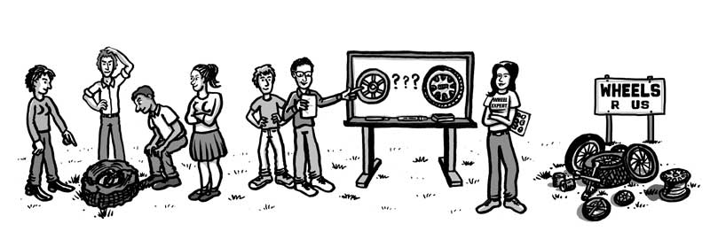
In project contexts we often hear people complaining that a team is wasting time reinventing the wheel, that they shouldn’t be solving something that’s already been solved, that they should instead focus on working faster or being more innovative. This is particularly...
A UX Picnic with Donna Spencer: The FAQ of information architecture
As an information architect, Donna Spencer often gets asks a million and one questions about what she does and how she does it. Through the years, some of the same questions kept popping up over and over again, and they’re what...

Old Dog? Time to Learn some New Tricks
Do you remember when there was so much to learn you didn’t think you’d ever learn it all? The feeling of trying out a technique for the first time? Or how about the first time you presented an idea and people actually agreed with...
How to Conduct A Content Audit
If you’re working on any kind of redesign project involving a large amount of content, such as that of a website, intranet or mobile site, one of the first tasks you’ll need to perform is a content audit. I say need, not want—a content audit isn’t something you’re...
How to Test an Information Architecture
So, you’re over the main hump of your Information Architecture (IA) design process. You’re happy with the IA you’ve come up with, it fits your content, and should work well for the users. Before you continue, it’s a great...
5 popular UX techniques I rarely use
Originally published by UXmas. Please note this was a deliberately controversial post (I think some of the commenters didn't quite get that). 5 Popular UX Techniques I Rarely Use 5. Sketching I rarely sketch. I don’t own a pencil...
7 reasons for crappy web content
We’ve been thinking a bit about content recently, so in a casual email to Donna Spencer, we asked her… “So why do people end up with crappy web content?” This is her most excellent response. Of course, this is easy for her given that she teaches web writing and wrote...
There’s no right answer
When we are working on a hard design problem (or even on a fairly easy one), we often realise there are many ways we could go – lots of options and lots of potential solutions. It can be frustrating to figure out which is the right direction to take, the right...

Classification schemes (and when to use them)
This post was part of a series of posts written by the speakers of UX Lx, a UX conference in Lisbon, Portugal. When you do information architecture work, you’ll realize that most sets of content can be organized in more than one way. One of the challenges for an IA...

How I Draft an Information Architecture
When I teach information architecture, the most common questions aren’t about the principles, but about the process. Just how do you decide on a particular method, how do you choose categories, how do you know what you’ve come up with is right? As a teacher...
Designing and selecting components for user interfaces
The article is about how to make sure your components will be usable and easy to learn. It covers some fundamental cognitive principles and their implications for component selection.
Four Essential Skills for Information Architects: An Interview with Donna Spencer
Jared M. Spool recently had the opportunity to talk with Donna about the specific skills that separate the best information architects from the rest. Here are the highlights of that conversation. Donna Spencer is a recognized expert in the area of...
Four modes of seeking information and how to design for them
This article examines four types of information-seeking behaviour, describes them and offers tips on how to design for them:
- known item
- exploratory
- don’t-know-what-you-need-to-know
- refinding
Usability for rich internet applications
Originally published by Digital Web Magazine: Usability for rich internet applications After struggling for years to design Internet applications around the limitations of HTML, I have been very excited by the recent release of a range of Internet applications with...
Taking a content inventory
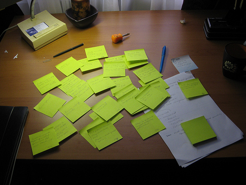
(this article was originally published on my blog, in 2006. I've re-published it here as there are still a lot of links to it) Taking a content inventory I’ve spent much of the past 2 weeks working on a content inventory. As a technique, it is pretty straightforward...
Why are intranets structured like the organisation chart?
Many intranets are structured around the organisational chart. It is well known that this method of grouping content is difficult for staff – they can’t find information if they don’t know who is responsible for it. However, it often seems too difficult to move from an organisational- based structure to a more intuitive topical structure.
Before moving to a better structure it is necessary to identify why the intranet is currently designed around the organisational chart, and address these issues first.
10 ways to continually improve your intranet
This article outlines 10 practical ways that an intranet can be improved incrementally without yet another redesign. Although some of the methods may require mini-projects to be set up within the intranet team, many of the methods can be applied alongside the team’s usual maintenance activities.
What is usability?
This article provides an overview of what usability is (and what it is not). It provides ideas on how to include more usability activities in projects and the types of activities that are needed in order to create more usable systems.
Using a “strawman” for page layout design
Designing the page layouts for a new or redesigned intranet can be complex. One of the most difficult aspects is creating the first layout. Starting with an empty screen, you need to determine what will go on each page and where it will go. Using a strawman design - a...
User-centred redesign of the FaCS intranet
This article documents the usability and information architecture activities conducted as part of the intranet redesign for the Family and Community Services intranet. Published by Step Two Designs: User-centred redesign of the FaCS intranet
Card sorting – A definitive guide
Card sorting is a technique that many information architects (and related professionals.) use as an input to the structure of a site or product. This article provides a detailed description of the basic technique, with some focus on using the technique for more...
Five ways to identify intranet usability issues
This article provides five techniques to identify likely usability problems in your intranet. Some techniques provide indications about where the main problems lie, others provide concrete evidence. Each technique can be used alone, or in combination to give you a...
Escaping the organisation chart on your intranet
This article outlines practical ways to move from an intranet based on the organisation chart to one that is more intuitive and allows people to complete their tasks more easily. It does not describe a full intranet redesign process, but focuses on those issues that...
Card-based classification evaluation
Card-based classification evaluation is a technique for assessing the usability of a hierarchical classification or a set of categories.Originally published on Boxes and Arrows: Card-based classification evaluation
