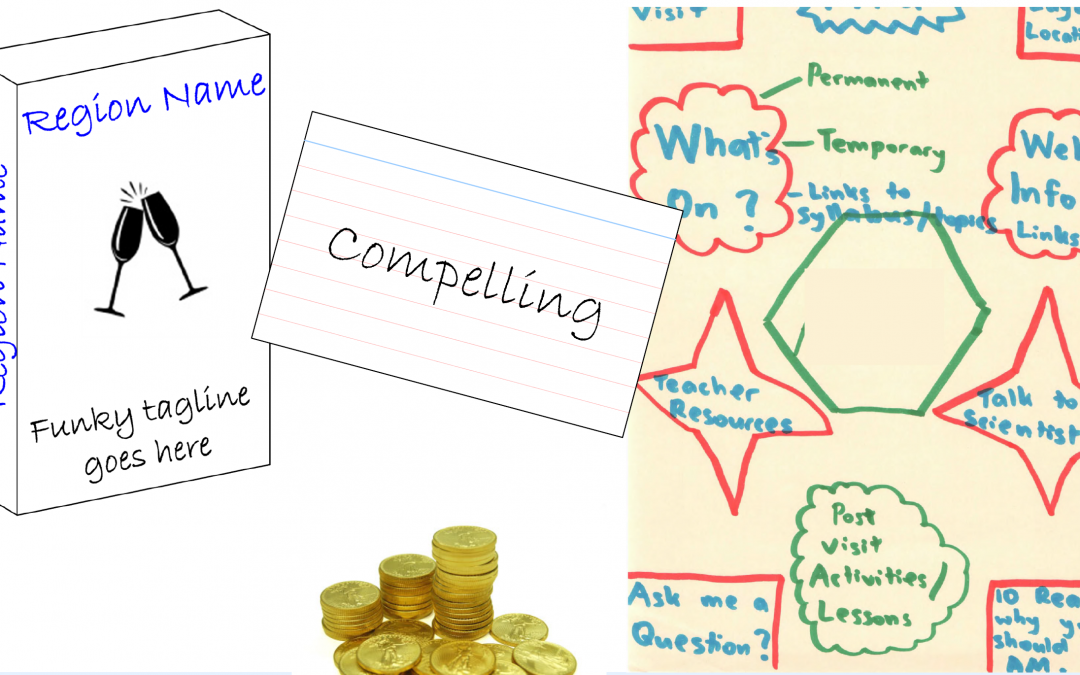
User research

Designing for people

Monday, June 16th, 2008

This half-day workshop teaches a set of fundamental principles that are useful for all types of design work – information architecture, interaction design, visual design and even industrial design.

In the workshop we’ll look at:

  • How our visual system works.
  • Visual and cognitive attention, and how to grab them.
  • The limitations of memory and how that affects our design.
  • The types of errors that our users are always going to make.
  • How to design intuitive interfaces.

For each of these aspects, we’ll talk about the principles, demonstrate how they work, and discuss the implications for design. You’ll go away with a better understanding of people which will help you make better design decisions.

Involving Users: Why is it so hard to do the right thing?

Monday, February 4th, 2008

Why is user involvement in projects the exception rather than the rule, despite the fact we know it is the ‘right’ thing to do? Taking a practical standpoint and without the boring and irrelevant theory, this presentation discusses the role of user involvement in web projects covering:

  • What types of projects need (and do not need) to involve users
  • Determine the value of involving users or the risks of not involving them
  • Methods and techniques appropriate for different situations
  • Low-contact, quick methods you can use to learn about users with little effort
  • Tips to help other people understand the value of user involvement

Doing a great job on the web

Tuesday, January 22nd, 2008

This is a talk I gave at Murdoch Uni. I wasn’t sure what to call it, but it basically covers principles of good website work – user research, good IA, great content, setting priorities and maintaining good work.

Card sorting analysis spreadsheet

Saturday, December 22nd, 2007

Over the past few years I have been slowly developing and refining a spreadsheet I use for analysis of card sorts. I have used it on many projects and find it invaluable for helping me manage the data and spot patterns.

I use it to analyse results from open card sorts. I have refined it to the point where I’m happy with it, and have prepared instructions for it. The instructions and spreadsheet are completely free for you to use however you wish.

Files

There are four files available:

Notes

Some other random notes:

  • I have done everything I know to make the PDF screen-reader friendly, but please let me know if it isn’t
  • I use a PC and know it works on a PC. I have had mixed response from friends with Macs – for some it works, some it doesn’t. If it doesn’t, please let me know and I’ll explore further

Screenshots

Entering the card names:

spreadsheet card entry

Summary of all cards and standardised categories:

standard_summary.gif

Analysis of categories:

cats_summary_analysis.gif

Visualisation of results:

correlation.gif

Card sorting book

I am currently writing a book on card sorting – check out the card sorting book website.

Involving Users: Why is it so hard to do the right thing?

Tuesday, November 6th, 2007

Why is user involvement in projects the exception rather than the rule, despite the fact we know it is the ‘right’ thing to do? Taking a practical standpoint and without the boring and irrelevant theory, this presentation discusses the role of user involvement in web projects covering:

  • What types of projects need (and do not need) to involve users
  • Determine the value of involving users or the risks of not involving them
  • Methods and techniques appropriate for different situations
  • Low-contact, quick methods you can use to learn about users with little effort
  • Tips to help other people understand the value of user involvement
View SlideShare presentation or Upload your own. (tags: user_research eotw08)

Design Games for Gathering Customer Insights

Sunday, October 14th, 2007

Would you like your design team to collaborate better? Are you looking to gather more valuable insights from your focus groups and interviews?

Design games are a fun, technology-neutral way of gathering design insights for your projects. In this presentation, Donna (Maurer) Spencer, an expert information architect, will show you how to take advantage of design games in many situations, with all types of people, including:

  • Design Your Ideal Page and Role Playing: Facilitates the brainstorming of design concepts and ideas
  • Divide-the Dollar: Prioritizes your site’s features
  • Modified Card Sorting: Helps you create content categories and terminology
View SlideShare presentation or Upload your own. (tags: design user-centred)

Information architecture and collaborative design

Tuesday, August 7th, 2007

This two-day interactive workshop will provide a thorough overview and understanding about how to effectively use information architecture to make your intranet or website as effective as possible. It will cover a wide range of information architecture issues such as the following:

  • What information architecture is and how it can facilitate user experience
  • Analysing and sorting content
  • Carrying out user research: surveys, focus groups and card sorting
  • Classifying, sorting and labelling within your information system
  • Using wireframes and site maps: the ‘bread and butter’ tools of IA
  • Navigating, indexing and designing page layouts
  • Effectively carrying out your IA project: tips, tools, techniques and processes

Website user experience & CSS workshop

Monday, February 19th, 2007

This workshop is run with Russ Weakley from MaxDesign.

Workshop description

A hands-on workshop with user experience expert, Donna Maurer, and CSSexpert, Russ Weakley.Over two full days you will build detailed websites layouts from the ground up – starting with page layout, navigation and form design; and ending with clean markup and elegant styling using XHTML/CSS.

Day 1: Planning and designing the user experience – Donna Maurer

On day one you will plan and design a website – focusing on the user experience: designing the navigation, page layout and forms.You will:

  • learn techniques to understand your users, and prepare user scenarios
  • understand your content with content analysis methods
  • create an effective and usable site structure (information architecture)
  • design a range of navigation methods
  • create page layouts for content, home, index and special pages
  • design simple forms

For each step, Donna will outline the fundamentals and show examples from small and large website projects. But most of the time will be hands-on -you work on your own project, ask questions and discuss with the group.

Day 2: Building beautiful sites using CSS – Russ Weakley

On day two you will build your website from the ground up – starting with structural markup, adding accessible markup and then styling your layout using CSS.You will learn:

  • how to create well structured, accessible markup
  • the basics of CSS including rule sets, selectors, shorthand rules, inheritance and the cascade.
  • how to structure efficient CSS files
  • how to create a full CSS layout from a flat graphic mockup
  • how to deal with browser issues including specific browsers such as IE5,IE6 and IE7.
  • how to create a resolution dependent layout
  • how to create CSS for printing and hand held devices

Testimonials

Feedback from participants from these workshops included:

  • “Great examples of how I can apply techniques”
  • “The comprehensive workbook with further references/books, examples and pictures was great”
  • “It was thorough, delivered with regular visual examples, solid knowledge, humour, functional activities”

Information architecture: A how-to

Friday, September 22nd, 2006

Description

There are 2 aspects to making IA work in a project – an understanding of the key principles of information architecture and a knowledge of activities to put them into practice. This presentation will examine the “how to’s” of information architecture. We’ll look at how to take a content inventory, analyse content, conduct card sorting, analyse user research, choose the right structure, create an information architecture and test it. These activities drive an informed design process so you can be confident in your decisions and communicate them to other people.

Presentation slides

View SlideShare presentation or Upload your own. (tags: ia information architecture)

Audio: Audio for IA: A how-to

Four modes of seeking information and how to design for them

Tuesday, March 14th, 2006

This article was originally published at Boxes and Arrows: Four modes of seeking information and how to design for them.

I discovered the concepts in this article while preparing material for an introductory information architecture workshop. In the workshop, I thought it important to highlight that one aspect of designing for users was to understand the ways in which they may approach an information task. I was already familiar with the concepts of known-item and exploratory information seeking: they are common in the library and information science literature and are also discussed in Information Architecture for the World Wide Web.

In my work on intranets and complex websites, I noticed a range of situations where people didn’t necessarily know what they needed to know. Additionally, when I opened my browser history to look for examples from recently-visited sites, I noticed that the majority of my own time was spent trying to find things that I had already discovered. These two modes didn’t fit into the concepts of known-item and exploratory information seeking. I call these “don’t know what you need to know” and re-finding.

I spent a while letting this rattle around my head, talking with IAs and designers, and realized that most only thought in terms of known-item searching. When discussing the other types of tasks, they’d ask with a horrified look, “So how do you design for that?”

Let’s look at the modes of seeking information in some depth and their implications for web design.

Known-item

Known-item information seeking is the easiest to understand. In a known-item task, the user:

  • Knows what they want
  • Knows what words to use to describe it
  • May have a fairly good understanding of where to start

In addition, the user may be happy with the first answer they find (though not always) and the task may not change significantly during the process of finding the answer.Some examples include finding out whether Katharine Kerr has a new novel, learning about how the CSS color:transparent attribute works, and getting a copy of the travel form. These are all clearly defined, easy to describe, and the starting point is straightforward.There are a number of design approaches to help with this type of task:

  • Search. This is a particularly good solution: people can articulate what they need and are able to type it into a search box. As long as the search results show the word in context or show a clear description of results, they are likely to recognise suitable pages from the search results.
  • A-Z indexes. These are great at supporting this mode, as users are able to articulate the word that they are looking for. As long as the A-Z contains the word the user is thinking of, all they need to do is read down the list and spot the right item. One way to make sure that the list of terms in an A-Z index matches the words that users think of is to look at the terms used during user research or in the search logs.
  • Quick links. Links to frequently used items allow easy access to them. Again, the terms in the list must match the users’ terms.
  • Navigation. Browsing via navigation can support this behavior. It is most likely to be effective when the user can clearly identify which navigation heading to choose from.

For this mode, it is important that people are able to answer their question quickly.

Exploratory

In an exploratory task, people have some idea of what they need to know. However, they may or may not know how to articulate it and, if they can, may not yet know the right words to use. They may not know where to start to look. They will usually recognise when they have found the right answer, but may not know whether they have found enough information.

In this mode, the information need will almost certainly change as they discover information and learn, and the gap between their current knowledge and their target knowledge narrows.

As an example, a few years ago I was looking for information on the cognitive mechanisms that allow people to navigate the physical world (I was comparing the concept of online and physical navigation). I knew what I was after, but couldn’t describe it (‘navigation’ in a search engine would return results for web navigation). I had no idea where to start. I tried a number of places and didn’t succeed at all. (Six months later I stumbled across some wayfinding papers and realised that was the term I needed).

Other examples of exploratory tasks include looking for history on the technique of card sorting, finding examples of sites with complex forms laid out using CSS, and finding music I like.

The first challenge can be getting the user to a good starting point (this was the main problem in the navigation example). This is less of a problem on an intranet as staff may only have one place to explore. Portal sites, subject-based directories, or sites with a wide range of content (such as Wikipedia) can provide avenues to follow on the open Web.Design approaches for this mode include:

  • Navigation. The most successful design solution will be browse, via navigation of all types. Browsing allows people to take some chances and follow a path, exploring, discovering, and learning as they go. Users may go deeper or broader in a hierarchy, or to related information.
  • Related information. Related links may be created from a list of related topics, a manually created list of relevant pages, or lists based on items purchased or recommended by other users. Contextual links may also be included in the body of the content.
  • Search. Search can be useful for exploratory tasks, but can be problematic due to the user’s inability to articulate what they are after. An initial search can help the user to learn about the domain and get some ideas for keywords. It can also be useful to provide synonyms for the search term as they may help the user to better articulate their query.

For this mode, it is critical that there are always avenues for exploration and that the visitor never reaches a dead end.

Don’t know what you need to know

The key concept behind this mode is that people often don’t know exactly what they need to know. They may think they need one thing but need another; or, they may be looking at a website without a specific goal in mind.This mode of seeking information occurs in a number of situations:

  • Complex domains such as legal, policy, or financial. For example, a staff member may want to know how many weeks maternity leave they are entitled to, but may need to know the conditions surrounding that leave. We should read the terms and conditions of new products and services as there maybe important restrictions, but they are too often buried in legal garble that we don’t read.
  • Any time we wish to persuade the user. For example, we would love people to know more about information architecture and usability, but they often don’t know that the concepts even exist. They may think they want to know how to make an accessible nested fly-out menu; we think they need to know more about organising the content properly.
  • Unknown domains. For example, when someone is told by friends that he or she should check out a new service, product or website, but does not yet know why he or she would want to know about it.
  • Keeping up to date. People often want to make sure they keep up to date with what is happening within an industry or topic, but are not looking for a specific answer.

The challenge is providing an answer while exposing people to the necessary information, thus showing what they may need to know. This can be achieved by:

  • Straightforward answers. Simple, concise answers allow people to have their initial information need met. For example, in the four situations above the websites could include a summary of the maternity leave benefit, the key issues of concern in the terms and conditions, an outline of the benefits of the new website or service, and a list of latest releases respectively.
  • More detailed information. Make more detailed information easily available. This may take the form of related links or contextual links in the body of the content.

The solutions allow people the satisfaction of getting an answer and then the opportunity to get additional information.

Re-finding

This mode is relatively straightforward—people looking for things they have already seen. They may remember exactly where it is, remember what site it was on, or have little idea about where it was. A lot of my personal information seeking is hunting down information I have already seen. I don’t know how prevalent this is, but discussions with others indicate that I am not alone.

Design solutions can be active (where the user takes explicit action to remember an item) or passive (where the user takes no action but items are remembered).

Active solutions exist on many web sites: wishlists (amazon.com), “save for later” (emusic), and favorites (Pandora). These solutions work well but require a conscious effort from the user, who needs to know they will want to return to an item in the future. Del.icio.us is another example of an active solution for the web as a whole.

A good passive solution allows users to see items they have seen before, order them by frequency of use, easily get to the content, and the information within it persists over time (longer than the current session).

Domains where passive solutions offer value include the following:

  • Shopping sites. Users may look at a number of products and may comparison shop before purchasing (e.g. Target, drugstore.com, Anthropologie, Classy Groundcovers, Expansys).
  • Weblogs. Readers may revisit favorite posts and watch comments on a post.
  • Article sites. Sites like Boxes and Arrows may have readers returning to their favorite articles frequently.
  • Support sites. Readers need to return to the same help topics.
  • Real estate sites. Potential buyers look at their favorite house over and over.
  • Complex search facilities. Users may wish to retain their search, modify it, or rerun it.

Identifying the modes

Once you understand the modes, examples are easy to spot during user research.

Known-items show up in heavy use of search with accurate keywords, when users can easily list what they need from the site and support e-mail will ask for specific content.

Exploratory information seeking shows up in search when vague phrases or repeated searches for similar keywords are used; when users express that they are researching, looking for background information, or “finding out about” something; and when support e-mails ask for general information.

“Don’t know what you need to know” is a little harder to identify. In interviews, users may express that they just want to keep up with things. It may also be clear that users do not have sufficient background knowledge or have not read information they should have. You can identify gaps in content by walking through the content, acting out a scenario from the user perspective, and checking that sufficient information is available.

Re-finding is easy to identify if your site has user registration and the logs show what pages people visit. You can also look at the number of items in wish lists.

Conclusion

The most important issue is not whether you notice a mode of seeking information that fits into one of these categories, but that a range of modes exist. Observe how your users approach information, consider what it means, and design to allow them to achieve what they need.

Note: Thank you to IAI members for suggestions for sites that offer navigation for the re-finding task.